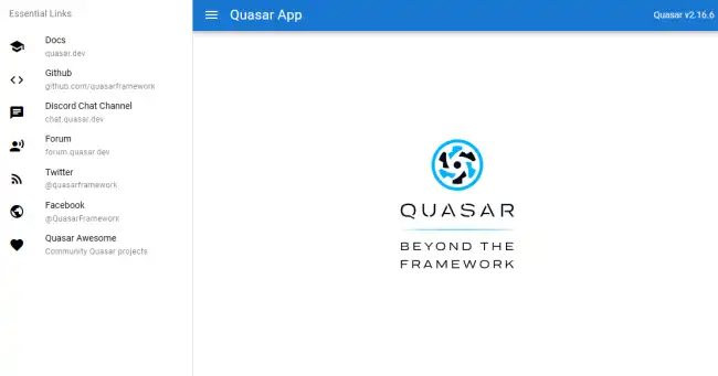
Quasar Framework is an open-source framework based on Vue.js that allows us to develop high-quality web, mobile, and desktop applications from a single codebase.
Its goal is to facilitate and accelerate development by providing a large set of ready-to-use components, tools, and configurations.
Quasar stands out for the following features:
- Cross-platform development: With a single codebase, we can build applications for web, mobile (iOS and Android), and desktop (Electron).
- Rich and customizable components: It offers a large number of UI components that follow Material Design guidelines and other modern specifications.
- Optimized performance: It is designed to be fast and efficient, making the most of Vue.js and Webpack capabilities.
- Powerful CLI: Quasar CLI simplifies project configuration and the development process.
- PWA and SSR support: It facilitates the creation of Progressive Web Apps (PWA) and Server-Side Rendered (SSR) applications.
Installing Quasar
To start using Quasar, we need to have Node.js and npm (or yarn) installed.
Creating a New Project
Once the CLI is installed, we can create a new project with the following command:
npm init quasar
Follow the on-screen instructions to configure our new project.
Starting the Development Server
To start working on our new project, navigate to the project directory and run:
cd quasar-project quasar dev
This will start a development server and open our application in the browser.

Installing Quasar CLI
Optionally, we can install Quasar CLI globally on our system using npm:
npm install -g @quasar/cli
Project Structure
The basic structure of a Quasar project includes directories and files such as:
src/: Contains the application source code.src/components/: Reusable Vue components.src/layouts/: Layout templates.src/pages/: Application views or pages.quasar.conf.js: Project configuration file.
How to Use Quasar
Creating Components
We can create new components inside the src/components/ directory. Here is an example of a basic component:
<template>
  <q-btn @click="sayHello" label="Click Me"/>
</template>

<script>
export default {
  methods: {
    sayHello() {
      this.$q.notify({
        message: 'Hello, Quasar!',
        color: 'green'
      });
    }
  }
}
</script>
Using Predefined Components
Quasar provides a lot of UI components that we can easily use. For example, to add a button and a dialog, we can do it like this:
<template>
  <div>
    <q-btn label="Open Dialog" @click="showDialog = true" />
    <q-dialog v-model="showDialog">
      <q-card>
        <q-card-section>
          <div class="text-h6">Dialog Title</div>
        </q-card-section>

        <q-card-section>
          This is a simple dialog.
        </q-card-section>

        <q-card-actions align="right">
          <q-btn flat label="Close" color="primary" @click="showDialog = false" />
        </q-card-actions>
      </q-card>
    </q-dialog>
  </div>
</template>

<script>
export default {
  data() {
    return {
      showDialog: false
    }
  }
}
</script>
Configuring Routes
Our application routes are configured in the src/router/routes.js file. Here is a basic example:
const routes = [
  {
    path: '/',
    component: () => import('layouts/MainLayout.vue'),
    children: [
      { path: '', component: () => import('pages/Index.vue') },
      { path: 'about', component: () => import('pages/About.vue') }
    ]
  }
]

export default routes;
Building for Production
When we are ready to deploy our application, we can generate the optimized production files with:
quasar build
This command will create a dist/ folder with the files ready to be served on a web server.

